Space X Start page

Bringing the dream of space travel closer — building trust, excitement, and a journey that starts before liftoff

Space travel for ordinary people may not exist yet, but the experience starts long before liftoff. Our challenge was to design a pre-booking journey that builds trust, excitement, and anticipation — making space tourism feel real and within reach.

Space X

Challenge

The goal was to enhance the experience for future space travelers, making space tourism feel more tangible and exciting. Since SpaceX does not yet offer commercial space trips, we focused on shaping the pre-booking journey, ensuring that potential travelers could imagine themselves embarking on this extraordinary adventure. By setting the right expectations and building anticipation, we aimed to bridge the gap between imagination and reality.

Insight

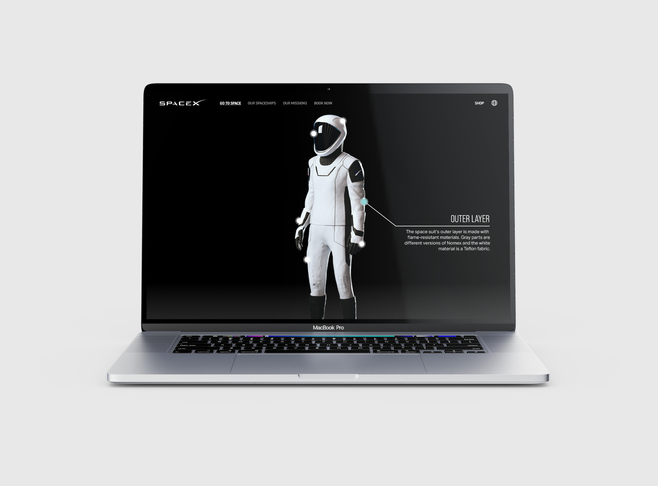
Designing for something that doesn’t yet exist — space travel for ordinary people — required us to think ahead and push creative boundaries. Unlike traditional travel experiences, space tourism comes with an entirely new set of uncertainties and expectations. Our challenge was not just to design an interface but to create an emotional connection that would build trust and instill a sense of security in potential travelers. By addressing concerns about safety, reliability, and the unknown, we sought to make space travel feel not only possible but also desirable.

Solution

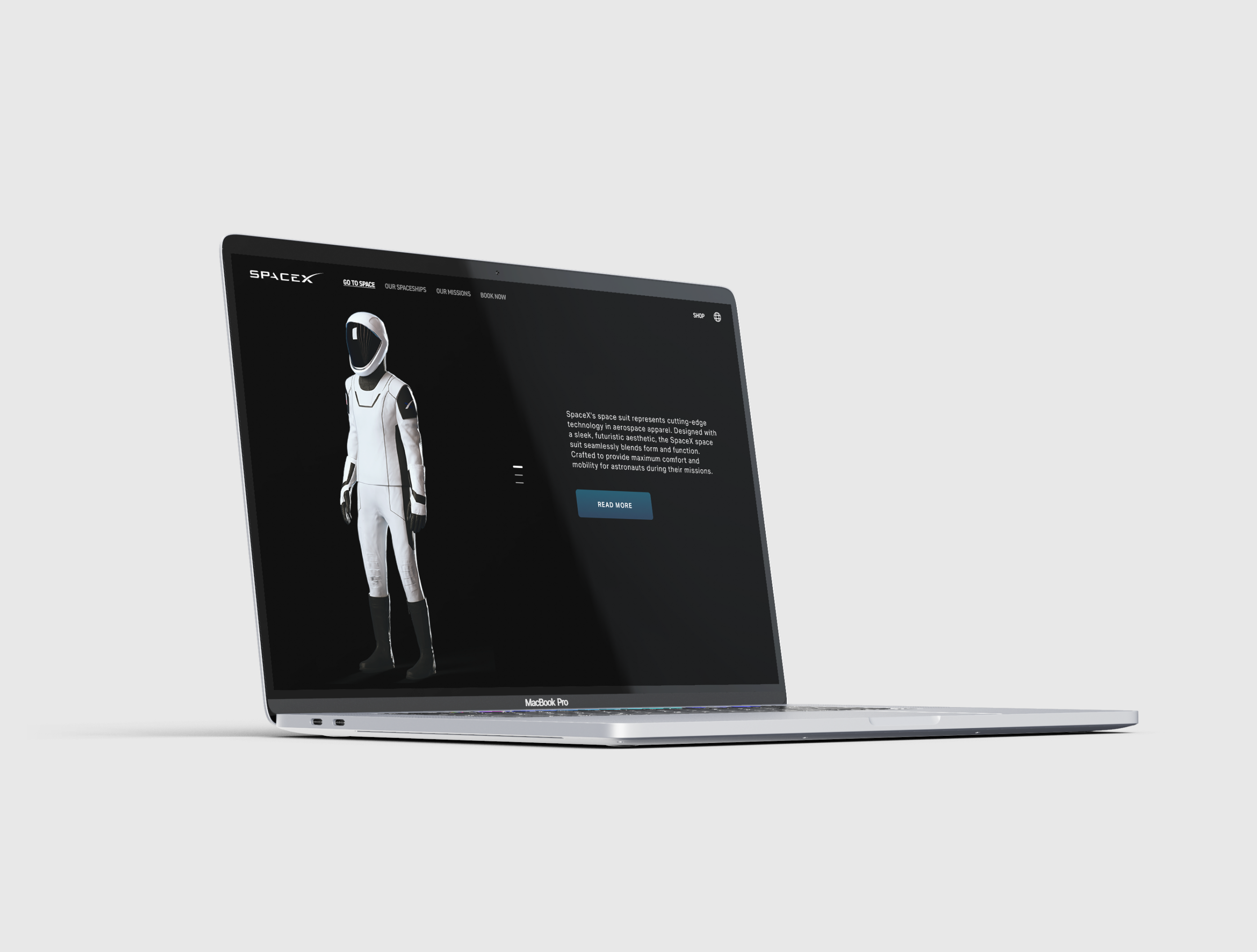
Our design aimed to inspire awe while fostering trust, striking the perfect balance between excitement and reassurance. We used breathtaking imagery of space to capture the grandeur of the unknown while incorporating elements that create a sense of reliability and security. Large, bold typography in headlines conveys confidence and authority, while carefully selected visual cues evoke both mystery and familiarity. By blending inspiration with a structured, user-friendly experience, we helped make space travel feel more accessible, exciting, and ultimately within reach.

Process

I began the project by thoroughly analyzing SpaceX’s existing website to identify areas for improvement and opportunities for a better user experience. From the start, I focused on defining the target audience — primarily the wealthy elite — but I also wanted to make space travel seem more attainable for everyday people. My goal was to create an experience that made space tourism feel like a realistic option for anyone daring enough to dream of it.

Next, I conducted an environmental analysis to see if any other companies were offering similar services. This research helped ensure that my solution would be not just innovative but also unique within the competitive landscape.

To ground my research in user behavior, I developed a futuristic scenario for interviews: “Imagine booking a flight to space with SpaceX, 40 years from now, where space tourism is common” This scenario allowed me to gather authentic feedback from users and understand their perceptions and fears.

Once I completed the interviews, I collected and clustered the data to uncover patterns. A clear theme emerged: people were excited by the idea of space travel, but fear was holding them back. If I wanted users to take the next step, the booking experience had to feel secure, trustworthy, and intuitive.

With this insight, I explored ways to design a booking journey that would make users feel confident while staying true to SpaceX’s brand identity. I focused on creating layouts and wireframes that emphasized user safety and adhered to core UX principles.

To validate the structure of my design, I conducted card-sorting tests to ensure the most important information was highlighted in a way that users found intuitive. Once I established a clear structure, I moved on to developing interactive prototypes that allowed me to test both the visual design (UI) and the user experience (UX).

I refined the design through multiple rounds of testing and iteration, improving the solution with each version of my high-fidelity prototypes. The result was a booking experience that felt futuristic yet familiar — an interface that balanced cutting-edge innovation with user trust and accessibility. By the end of the project, I had created a seamless digital journey that made the idea of space travel feel not just possible, but exciting, safe, and within reach for everyone.

Next project